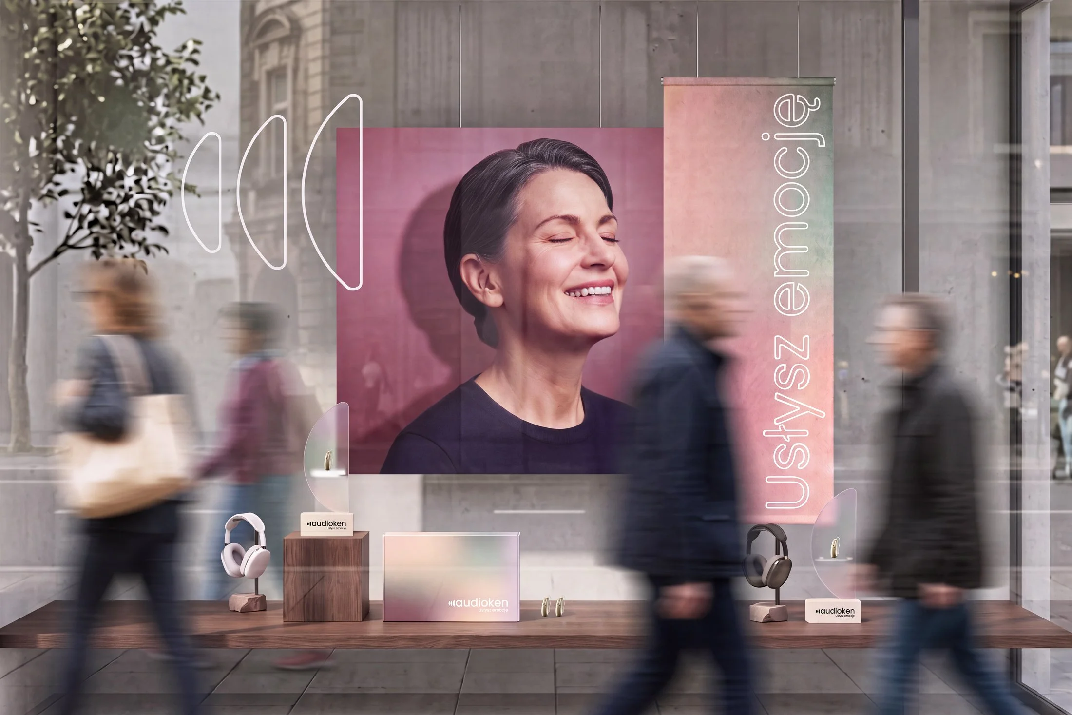
Audioken
Hearing, through emotion.
Hearing connects us to voices, conversations and everyday moments. Losing it can mean slowly becoming disconnected from them; regaining it can bring those sounds — and the emotions attached to them — rushing back. I built Audioken’s identity around this idea, creating a visual world where sound is expressed through emotion, across identity, imagery, campaigns and communication.
Creative Direction · Brand Identity · Art Direction · Campaign · Photography · Print · Retail

MAKING SOUND VISIBLE
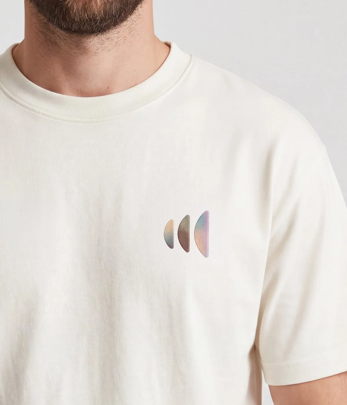
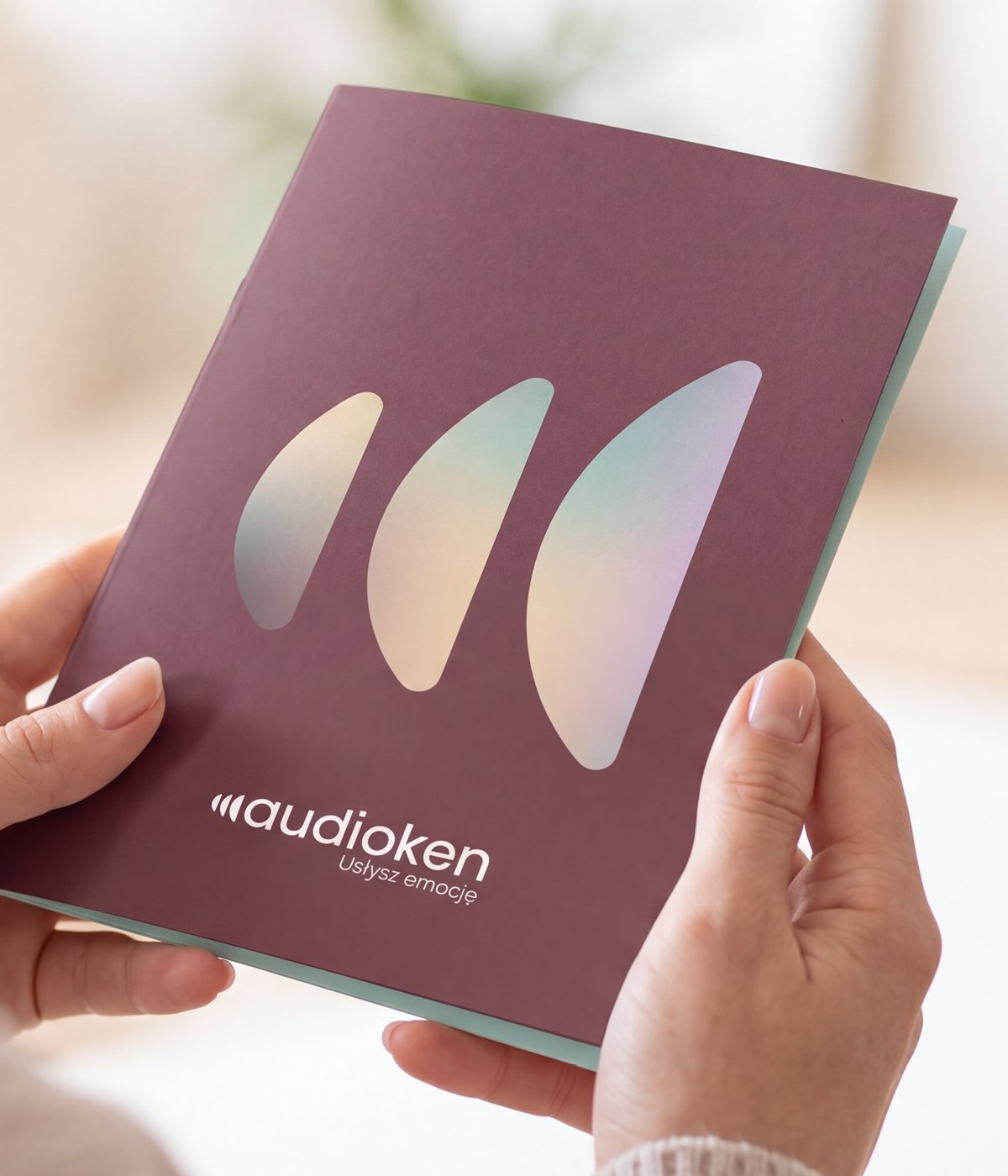
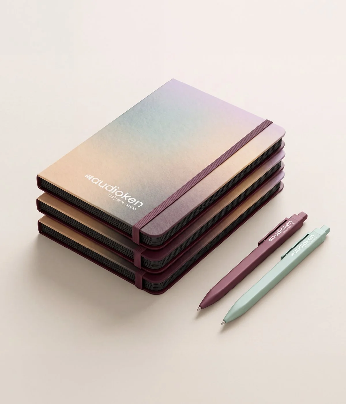
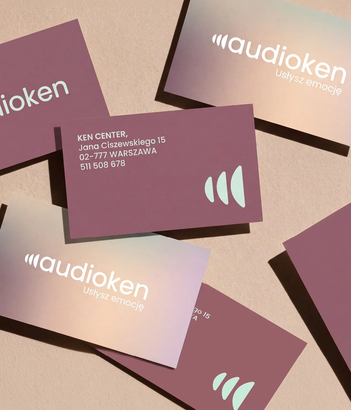
The identity transforms sound into a visual language of soft forms, translucent layers and shifting colour. The sound symbol became a recurring signature across the brand — from print and communication to objects and clothing, where it sits over the heart, connecting sound back to emotion.
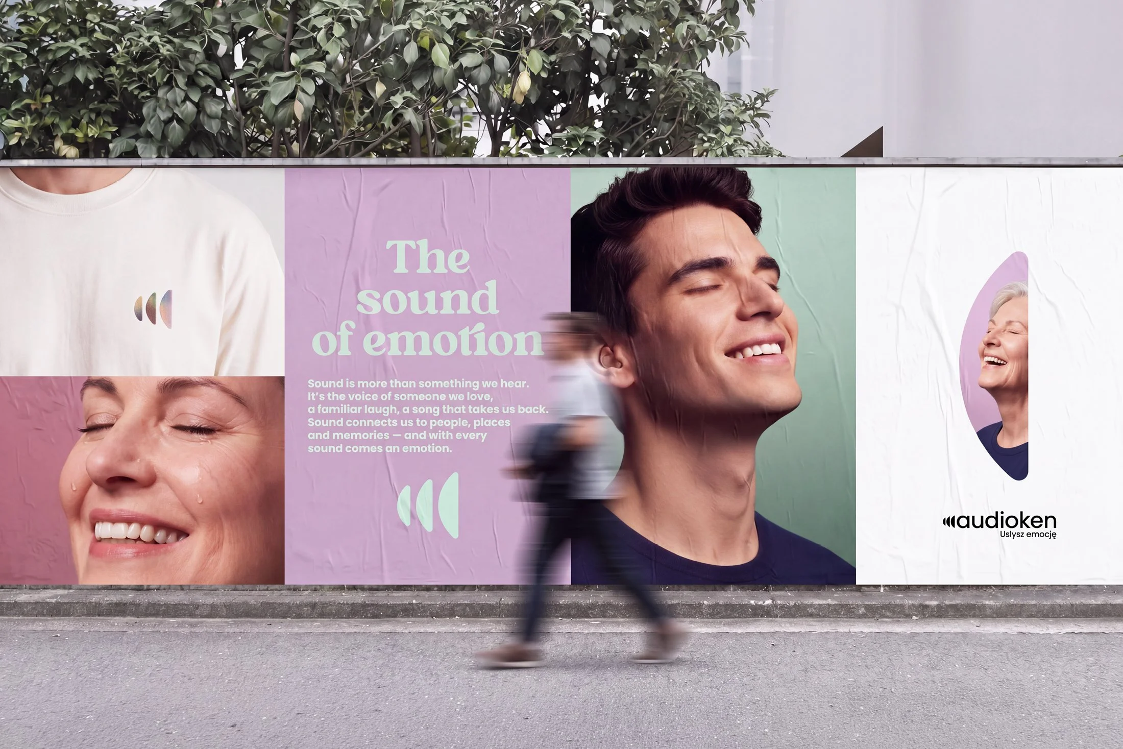
THE SOUND OF EMOTION
Rather than focusing on hearing loss, the campaign focuses on what hearing gives back — voices, connection, laughter and the emotions that come with them.
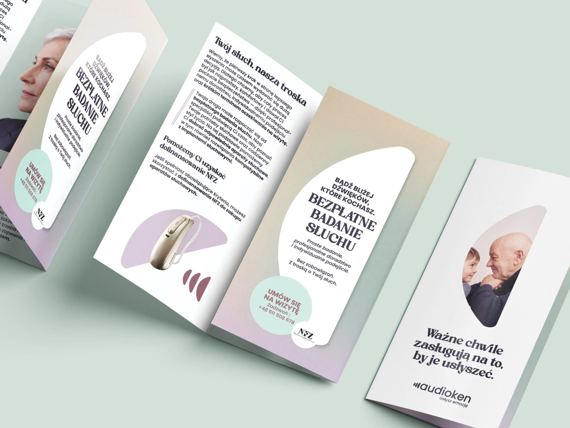
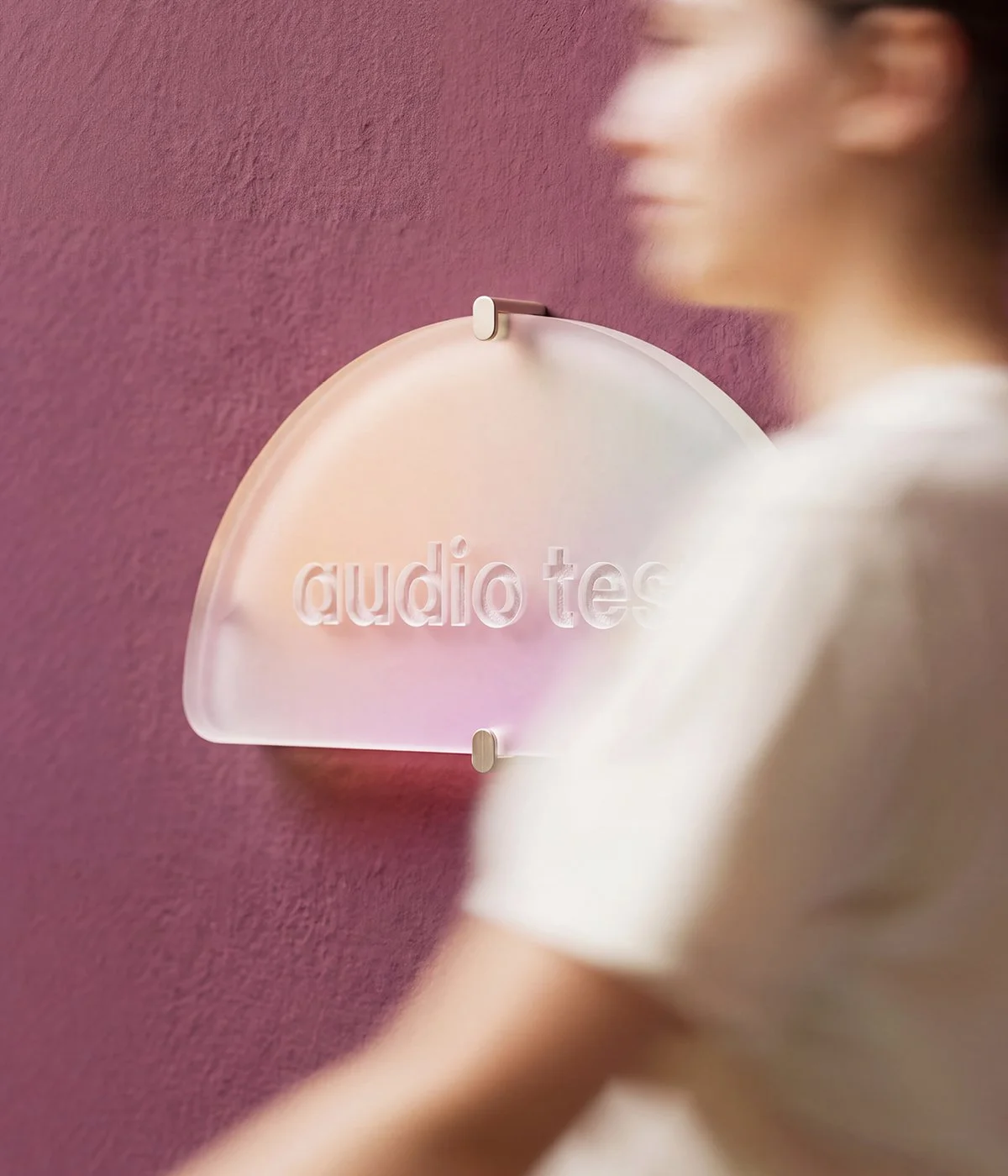
FROM GRAPHIC LANGUAGE TO OBJECT
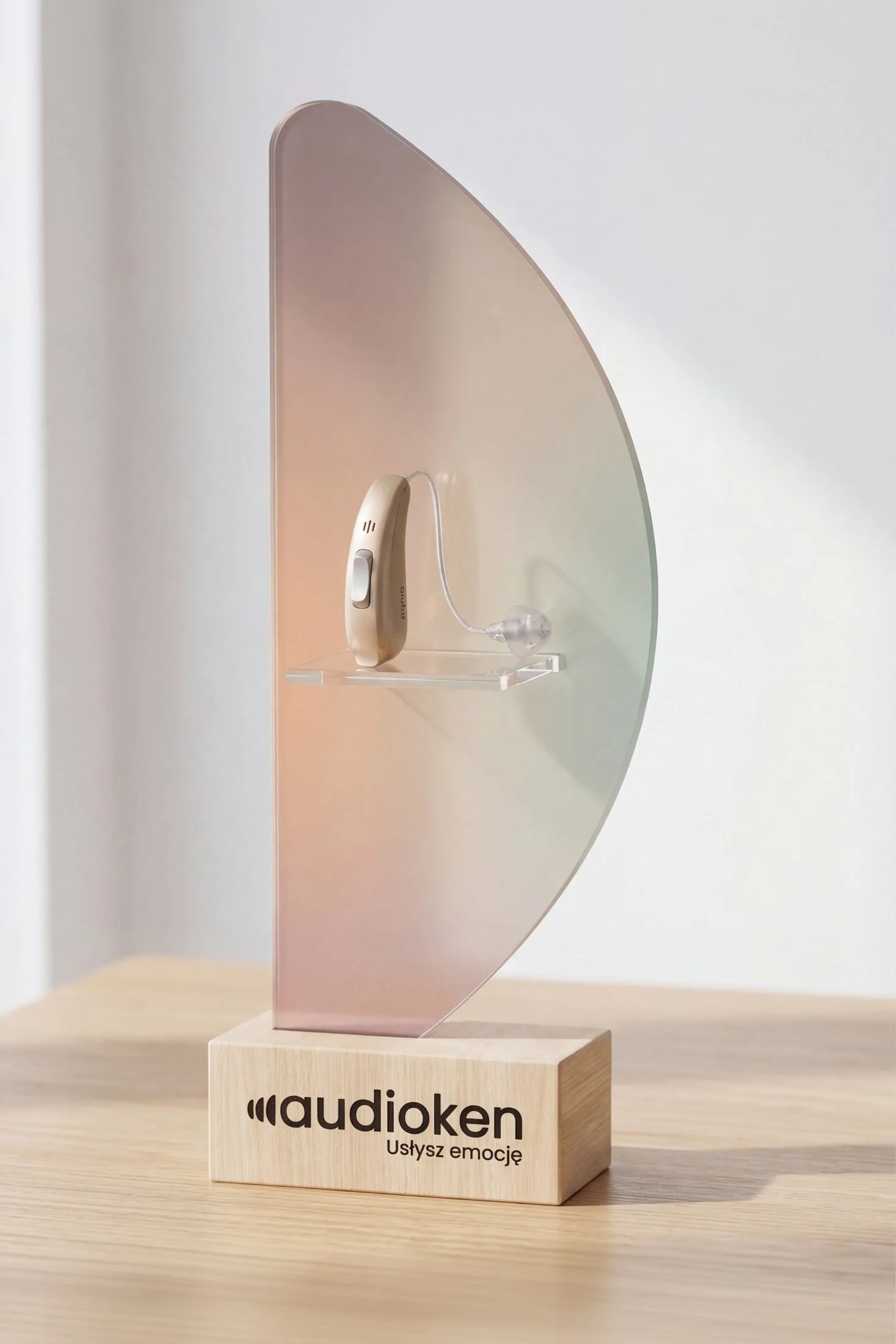
The forms developed for the identity moved into the physical world — translated into custom displays designed to present hearing technology as something considered, desirable and beautifully integrated into the Audioken experience.
BRINGING THE BRAND INTO THE SPACE
The identity extended into the physical environment, bringing photography, product, colour and the sound-inspired forms together as one experience.